fundraising
Successful Fundraising Graphic Design: Why You Shouldn’t Cram 15 Pounds Into a 5-Pound Bag
This interview and post were done by Nancy Owen, Senior Writer at RNL.
Great fundraising graphic design helps your appeals capture the imagination of your audience. But what makes for great design? I sat down with Shannon Blazek, RNL senior designer, to discuss this very topic. We discussed what inspires good design, best practices for design, and why RNL works collaboratively across teams to deliver the best design possible for our clients.
“Design has always intrigued me.”
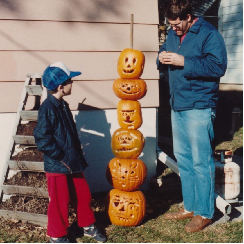
Back in the era of video rental stores, eight-year-old Shannon Blazek walked through the aisles with his parents hunting VHS movies to rent. It wasn’t the titles that spoke to him; rather, it was the movie posters and VHS covers that caught his eye.
“Design has always intrigued me,” says the senior designer at RNL. “I like when things are visually appealing. Those vivid VHS covers had great designs. And I still admire movie posters.”
Blazek decided to become a graphic designer and spent 20+ years working in the industry, including time at a newspaper and printing press. Along the way, he also honed his craft as a freelance designer. Five years ago, Blazek joined the RNL team of 13 designers and soon won awards for his fundraising campaigns.
Creating award-winning fundraising graphic designs
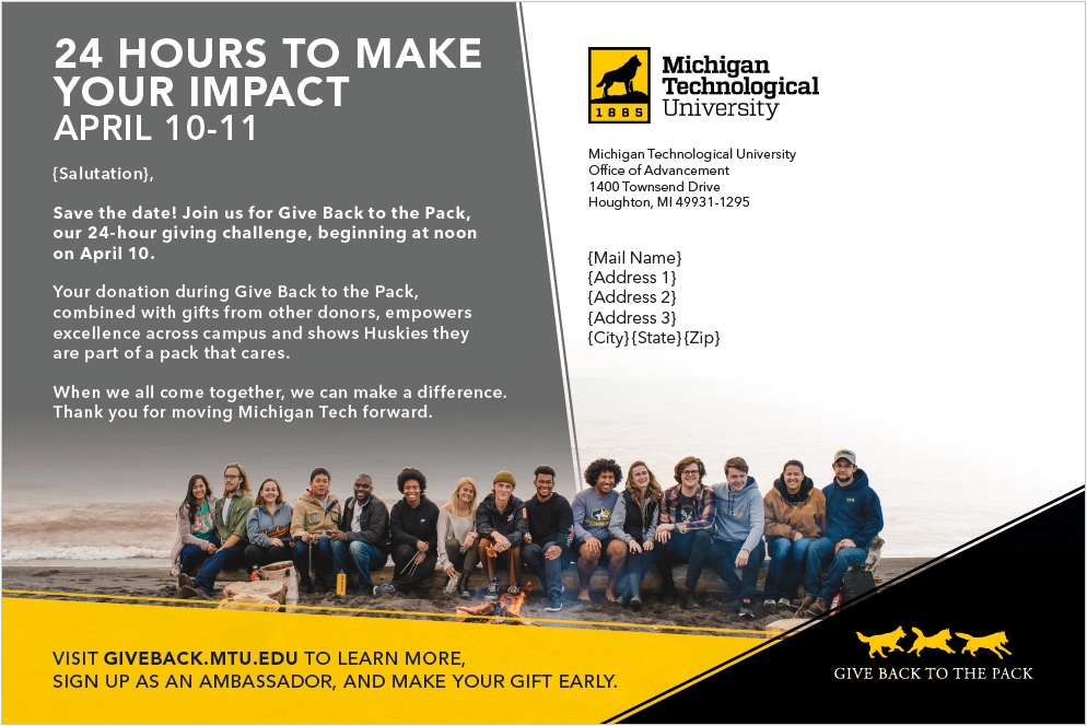
This year alone, Blazek contributed to creative campaigns that won a total of three gold, three silver, one bronze and three merit awards. Blazek’s most recent award was Gold recognition from the Educational Advertising Awards for Total Fundraising/Development Campaign. Blazek designed the Giving Day campaign for Michigan Technological University.
“I’ve been working with Michigan Tech since they partnered with RNL,” he says. “They know they’re in good hands with us and trust RNL.”
Blazek makes a point of researching every client before their first meeting and also reviews assets for every new campaign. He wants to have a taste for their design preferences so he can best represent each client’s personality.
For their Giving Day campaign, Michigan Tech provided publication samples and images and welcomed RNL’s design ideas. After reviewing their desktop and mobile phone backgrounds, Blazek was struck by their use of lines. “I wanted to include those angled elements,” he says. “They lead the eye around the design as well as organize the content in scannable pieces that provide movement in the design.”
Client assets boost campaigns
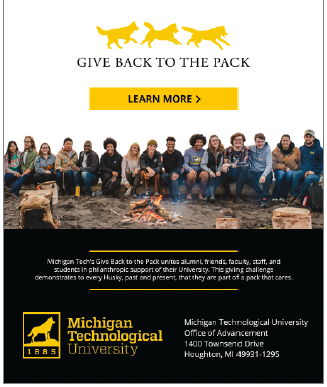
“As designers, we like receiving lots of client images and assets from which we can choose and improve,” says Blazek. “I’d much rather have something extra and not need it.”
Blazek found inspiration from Michigan Tech’s mobile designs, leaned into their main brand colors, focused on symmetrical design, and sought high-quality images that told a story and represented diversity. When it came to their email design, he incorporated best practice responsive design since the majority of today’s readers open email on their mobile devices. Blazek also designed the mailer to pass the USPS’s mailing guidelines.
As with all RNL designs, Blazek was laser focused on complying with the Americans with Disabilities Act (ADA).
“When we make everything ADA compliant, it extends the audience,” he says. “We want everyone to have access; we don’t want anyone to struggle accessing our designs or our client’s messages.”
Ready for your award-winning fundraising campaign?
RNL creates world-class fundraising campaigns for colleges, universities, healthcare institutions, and nonprofits. Find out how you can benefit from our award-winning creative, insightful analytics, and unparalleled fundraising expertise. Ask for a complimentary consultation.
Clarity wins the day
Design is subjective. And perhaps no one knows that better than designers themselves. But what always works is clarity.
“Clear and concise designs catch people’s eyes,” adds Blazek. “We ensure the message is front and center. And negative space adds room to breathe. After all, we don’t want to cram 15 pounds into a 5 pound bag.”
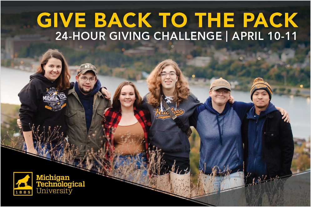
Blazek has a tried-and-true approach for taking campaign concepts and delivering designs clients love, clients like Michigan Tech.
“Communication is key because the process is a team effort,” he says. “When we discuss the design foundation, we can mold and translate that into what the client wants. We all share the same goal: appealing design that attracts the reader’s eye and writing that draws them in.”
The power of collaboration
RNL writers and designers work together to find the best solutions for our clients. We are flexible, nimble, and accommodating. For example, Blazek knew his design for Michigan Tech had to complement the content from Dr. Marci Nauman, RNL senior writer. So the two worked together to create the award-winning campaign.
“Marci keeps the communication lines open,” says Blazek. “We collaborate and together we find solutions.”
Nauman wrote a multi-channel outreach (MCO) campaign for Michigan Tech that included digital boost, email, and a postcard.
“Michigan Tech has a strong, compelling brand, and we knew that we needed to present a cohesive campaign that helped campus accomplish their goals,” says Nauman. “By brainstorming with both Shannon and the campus partner, we were able to do just that.”
And the result of this collaboration was an award for not only RNL, but for our client. In fact, Michigan Tech raised more than $560,000 in 24 hours! “Partners realize we take pride in what we do,” says Blazek. “Successful partnerships make everyone happy. And that’s the real reward.”
Want to increase donor engagement with award-winning appeals? Let’s talk.
RNL’s creative team has won more than 100 awards in the last five years, and you can leverage our strategic insight, world-class creative, and omnichannel outreach to make meaningful connections with your donors. Contact us for a complimentary consultation and we will set up a time to talk about creating winning campaigns for you.
