fundraising
High Conversion Drives Digital Giving Day Success
Giving Days have really taken the fundraising industry by storm and as we get closer to this year’s #GivingTuesday, we’re getting questions about what makes up the best online days of giving. One key thing to consider is how likely people are to make a donation once you’ve attracted them to your site. This metric is what we refer to as conversion.
What is digital conversion?
Conversion is the act of a visitor who has come to a site fully completing a giving transaction. In the case of a Giving Day, it’s a visitor who actually makes an online gift after landing on the page.
How does RNL define conversion?
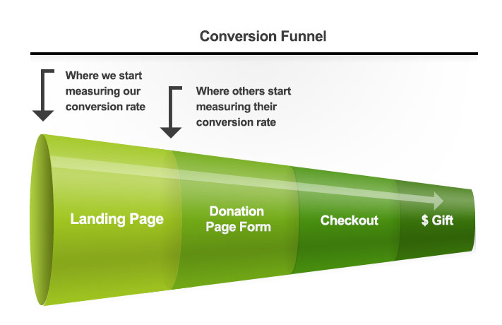
We define conversion rates as the rate of users who land on our Giving Day (or crowdfunding project) main page and then complete a donation. We start at interest and end with actual gifts.

Many other providers define conversion differently, and this can lead to very high “conversion rate” reports. While others define the conversion rate as sessions on the donation page form that lead to a checkout, we focus on the translation of interest to action, the people who click to find out more and then ultimately end up giving.
It’s definitely important to look at how many people complete your donation page form. This is an indicator of how easy your form is to complete. But you won’t get many people clicking to the give form if you haven’t converted on their initial interest.
Conversion tactics of the best giving days
Now that we’re on the same page with the metric, I’ll share the results of a study of some of the best programs. I looked at 10 giving days and our conversion rates from initial click range from 14%-25%, which is significantly higher than the average conversion rate on general higher education web clicks. It’s also quite a bit higher than response rates to traditional appeals such as direct mail.
Here’s what I noticed that made a difference for the days with the highest conversion:
Well-Designed pages
A truly well designed page needs two things: a great “Call-To-Action” (CTA) where all other aspects of the page are driving towards that call to action, along with a clean and visually pleasing design.

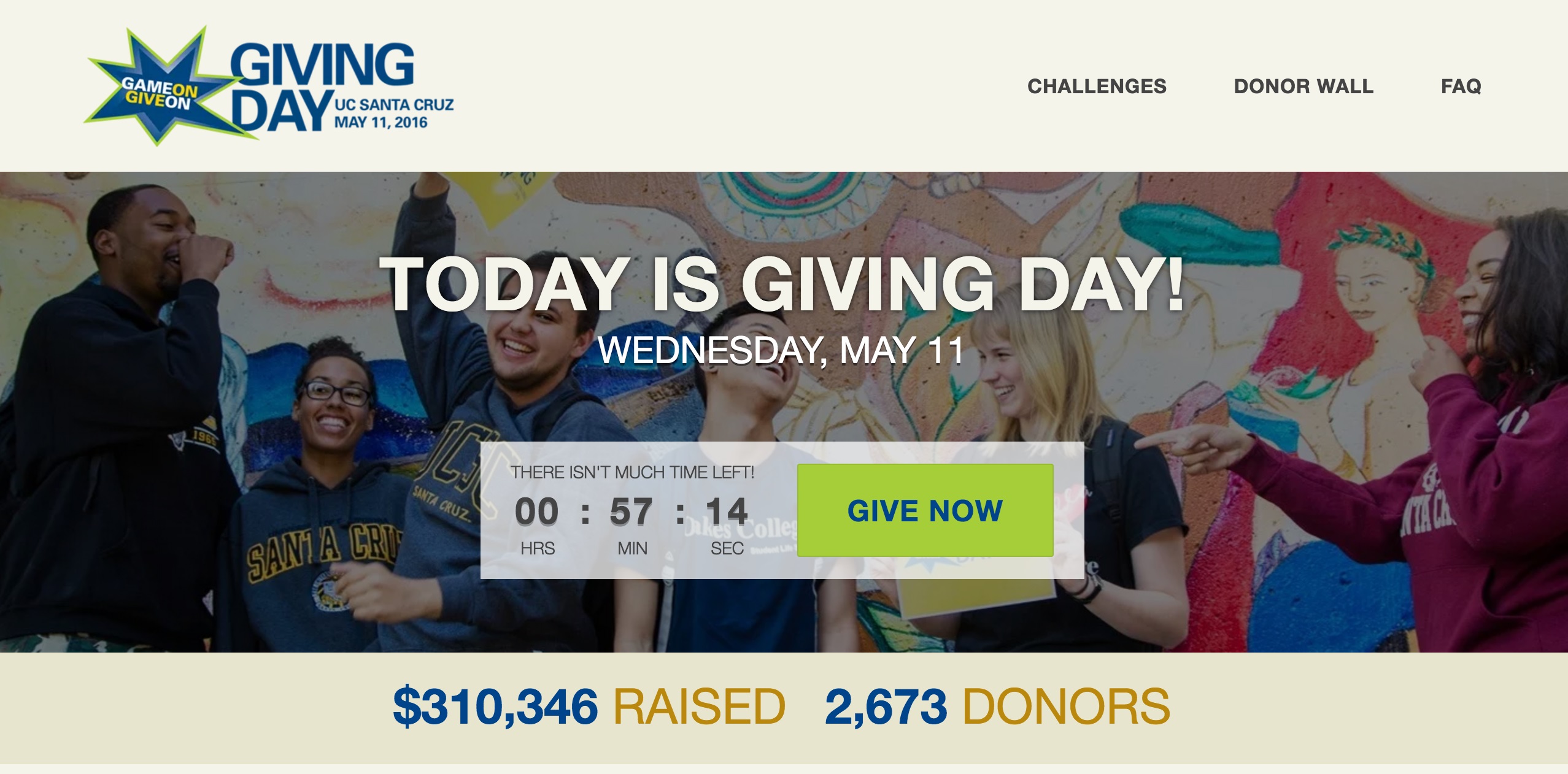
On the RNL Scalefunder Giving Day module, we have kept the design focused on the Give Now button at all times, so that site visitors can donate easily, and we’re really driving donor interest to that action. All pages are also mobile responsive which is absolutely critical.
Focused Content
We put a lot of thought into what should be shown on every page. Each element on RNL Scalefunder giving day pages is shown only if it improves clicking on the call-to-action (and therefore boosting conversion). In particular, our Giving Day module includes events that are dynamic and focused on only the most relevant information per page. When Matches and Challenges are over, they disappear from view. We try to keep our pages simple and relevant. This is a very important user optimization tactic. As product mentor Aziz Musa says: “simplicity isn’t just the absence of complexity; rather it’s the mastery of it.”

Another example of focused content are personalized department pages that keep all content focused on that specific area of the institution. The donors who care about their area want to see things that matter to them. Our conversion rates are generally higher with donors who give after viewing focused department pages before donating.
Targeted Advertising
A key metric of conversion would be getting the right people to the site to begin with. With our targeted advertising product Digital Dialogue, we serve ad impressions to potential donors prior to and on the actual Giving Day. That way, if your donor is on Facebook, Linkedin, Instagram, or any other website, they’ll be sure to know about your Giving Day and will be more likely to participate.
Following up with people who dropped off
In addition to beautifully designed, focused pages, we also account for those who may have visited our sites but dropped off before donating. This abandon rate is normal, but in order to minimize it and re-attract potential donors who show some interest in the Giving Day, we offer an “incomplete transaction report” that identifies the donor and contact information so that those donors can be sent emails to come back and donate. This data can also drive retargeting communications, a key digital strategy all fundraisers should consider using.
Ambassador (peer-to-peer) lead generation.
Our platform makes it easy to get ambassadors to inform their friends of their Giving Day. These are people you strategically engage to push out the message through their social networks. In fact, half of the donors in a recent Giving day by Alpha Delta Pi, a Greek organization, came from ambassador outreach. Ambassadors are one of the top drivers of donation conversion because they help bolster the importance and authenticity of your message from someone the donor trusts. Having a Giving Day platform that tracks ambassador activity is crucial to enable this.
Conversion is complicated, and technology helps
In looking at the best Giving Days, there are a number of “x factors” outside of what I’ve listed that probably made a difference. If you have very engaged donors, such as at institutions with high alumni participation or charities that regularly receive multiple gifts per year from donors, you’re going to see higher conversion. But even if you are still building donor loyalty and engagement, using these strategies will make a world of difference.
The right design and content are crucial to digital donor engagement. And using the best technology makes it all possible.
To find out how you can transform your donor engagement with the RNL ScaleFunder Giving Day and Crowdfunding platforms, drop us a line. Over 120 institutions have already taken this step to engage 21st century donors.