fundraising
2017 March (Alumni Giving) Madness – The Final Eight
UPDATE: The winners have been announced, click here to see who won
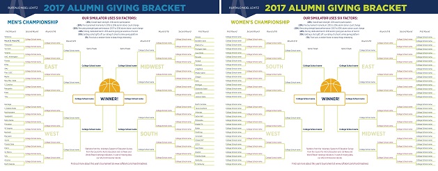
People are talking after our first two rounds of the 2017 March (Alumni Giving) Madness tournament. This week, we’ll get down to eight teams—four from the men’s bracket and four from the women’s.
In case you didn’t know, this alumni giving tournament is our fun way to look at higher education fundraising and dive into the data of alumni giving statistics. It started last year when one member of our team asked the question:
What if the NCAA brackets were decided based on alumni giving statistics?
You can read about the methodology we’re using to answer the question this year in our first post. The data comes from public sources, the Voluntary Support of Education Survey and the U.S. News and World Report college ranking data.
Check out the final results here.
Round 3 and 4 insights:
Trends from the first two rounds continued, but a few insights this round:
- The battles were intense: As you would expect as you do anything with progressively narrowing alumni giving statistics, the scores are very close. There were wins of within .0025 points (out of a max 64), representing the best buzzer-beater final scores you’d see in basketball.
- The final shot can make a difference: We saw a very wide range of giving portals and online giving presence from this year’s tournament institutions. While our refs rating of online giving presence (the only subjective score in this year’s tournament) was worth only 10%, it made a difference for a number of wins.
The Referees speak: online giving portal ratings
Our referee team is made up of online giving experts, marketing experts, and fundraising geeks at RNL. Below are a few things the refs said with their ratings.
“The giving site was not mobile responsive, and it was hard to even find the giving page from the University web site. They’re also asking for too much information. I am sure this means many people don’t complete a gift.” (below average score)
“A great, responsive design on this giving portal with an easy search function. They could have pre-populated some fields, but overall, very strong.” (above average score)
“It wasn’t really clear where I needed to click to give. Their giving page is a really rough and it took at least 3 clicks to give. Not very mobile friendly. They do have a crowdfunding site but you can’t find it with google search and they don’t link to it from giving pages.” (below average score)
“It only took 2 clicks to give and the site was mobile-enabled. Lots of giving options with a great site design. They have crowdfunding but the only link from the giving page was tiny bottom left corner of page.” (above average score)
“What a stellar website. I can easily make a donation of my choice from one landing page. I loved that that they are offering a match for every dollar you donate to the scholarship fund.” (perfect score)
“The alumni option is a whole screen down, and the major call to action is to get a membership to the alumni society. The option to make a gift gets lost on the alumni page. Couldn’t find it at all on mobile.” (below average score)
“The web site was just overwhelming and difficult to navigate” (below average score)
“Scrolling donor wall, social media sharing, a crowdfunding platform—all really great. But still, over 6 clicks just to get to a donation page!” (average score)
“Clicking on ‘Give’ from the University home page took me to a mobile-optimized page where I was immediately prompted to enter my information and gift purpose. It’s surprising how many places don’t take you immediately to this page. Why make donors hunt?” (above average score)
My school isn’t in the NCAA baseketball tournament—can I still participate?
 You can find out how your alumni giving compares to your peers by requesting a Donor Comparison Report. Using data from the VSE survey, this report allows you to benchmark your alumni giving statistics and identify alumni giving trends. Request your free report here.